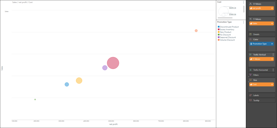
Bubble charts use the first three columns of a query to plot the x, y and z axes (and then every subsequent set of two columns). The rows of the query, which are typically used as the basis for the categories of a chart, are displayed as data points in the plot.
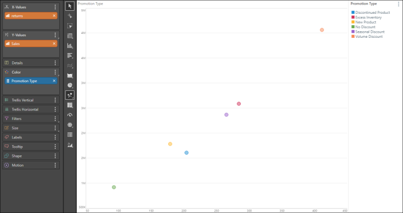
The z-axis in this case is represented by the SIZE of the bubbles - add the measure that should influence the size of the data points to the size drop zone.
The bubble chart required a measure in the X-Values drop zone, a second measure in the Y-Values zone, and a third measure in the Size zone. It also requires a member hierarchy in the Color zone.
Note: A bubble plot chart cannot be viewed with fewer than three columns of data.
Build a Bubble Chart
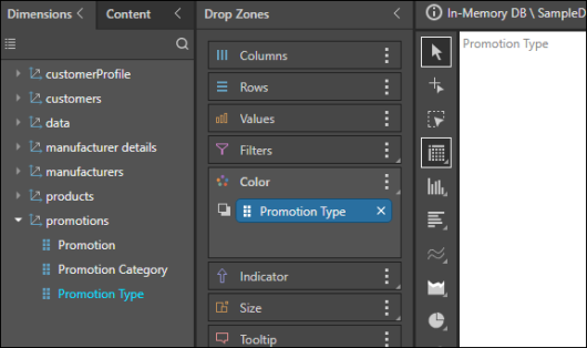
Step 1
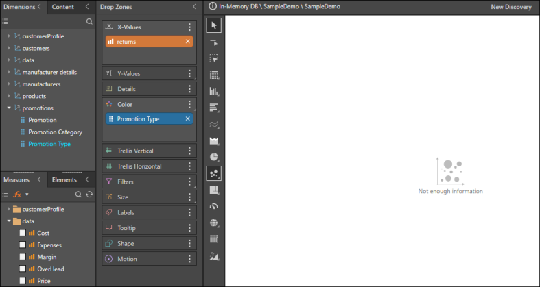
Add the required member hierarchy to the Color drop zone.
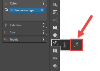
Step 2
Select Bubble Chart from the Scatter Chart fly-out menu.
Step 3
To the X-Values drop zone, add the measure that should be on the x-axis.
Step 4
To the Y-Values drop zone, add the measure that should be on the y-axis.
Step 5
To the Size zone, add the measure that should drive the size of the bubble chart's data points.